
Case Study:
The North Face
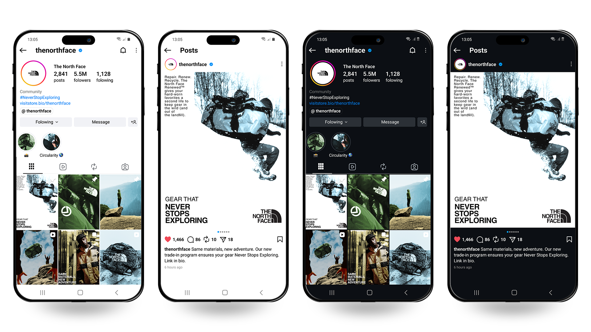
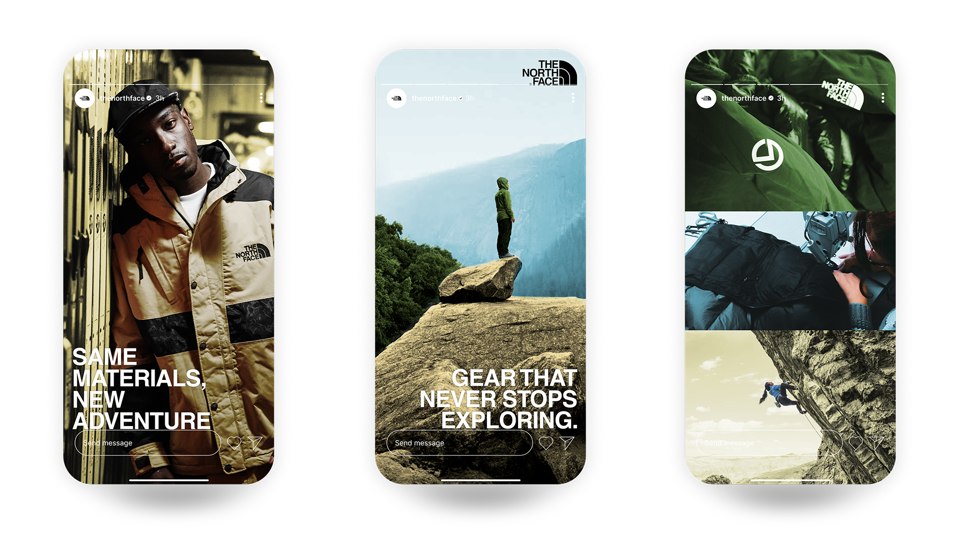
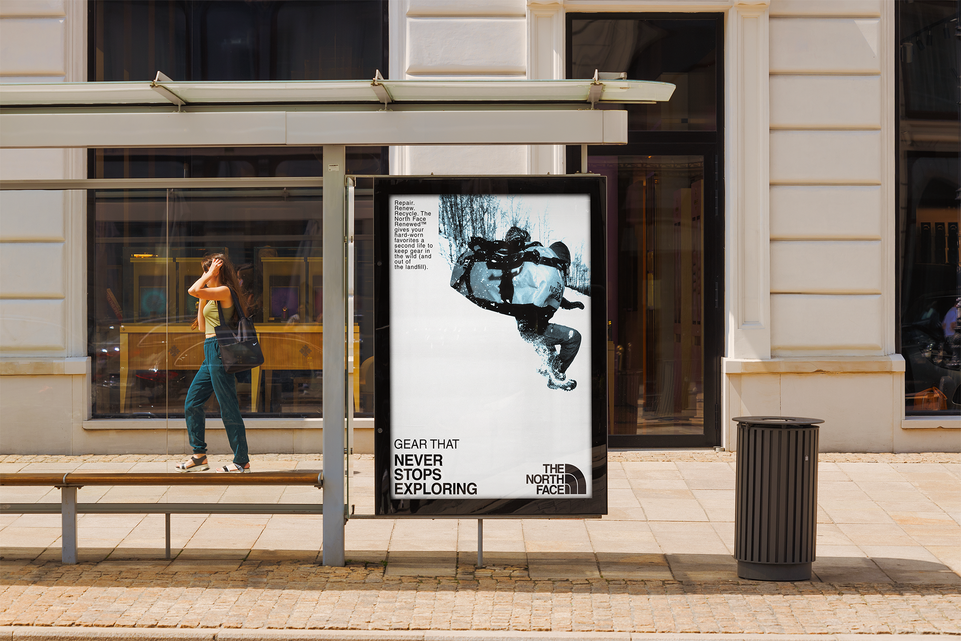
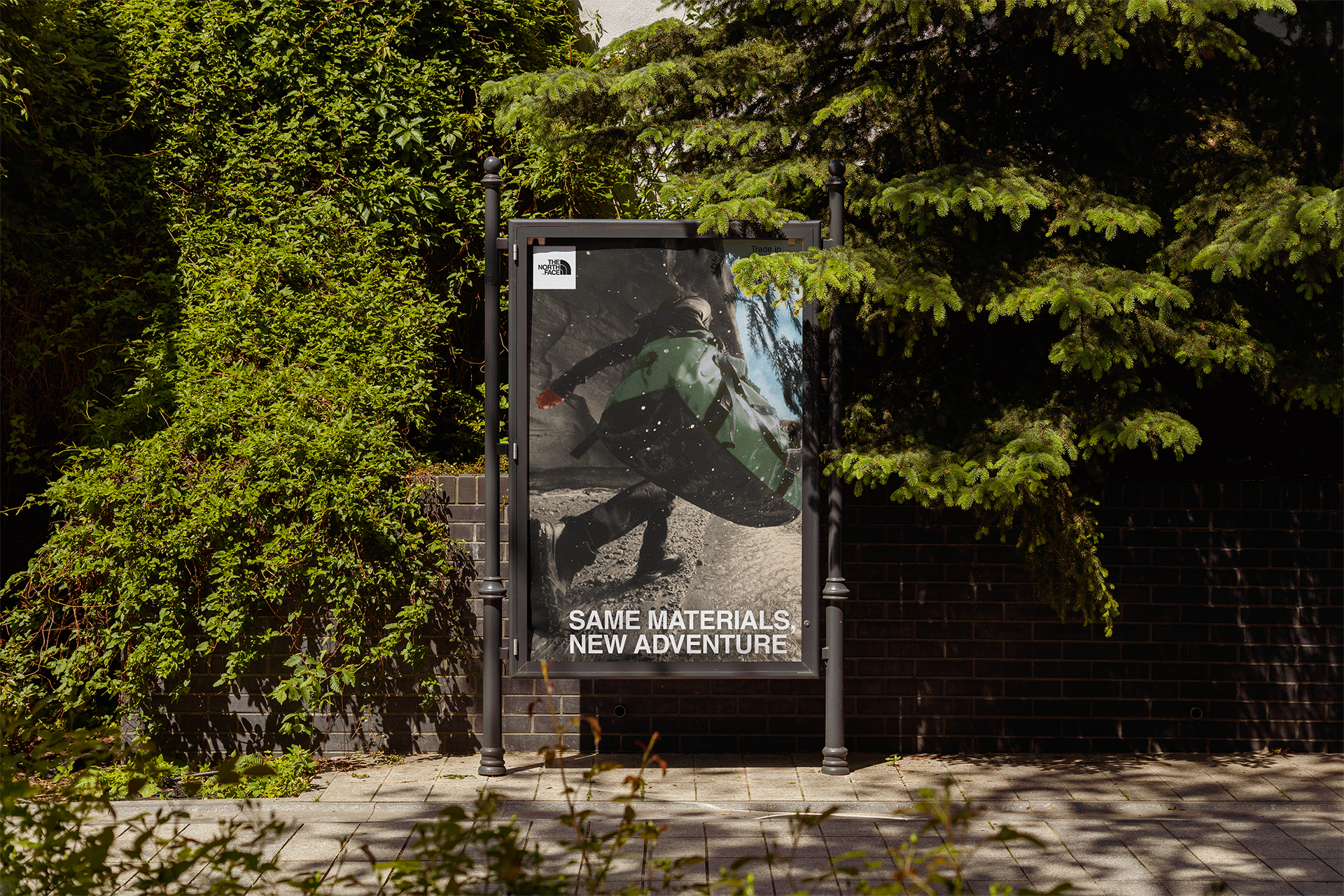
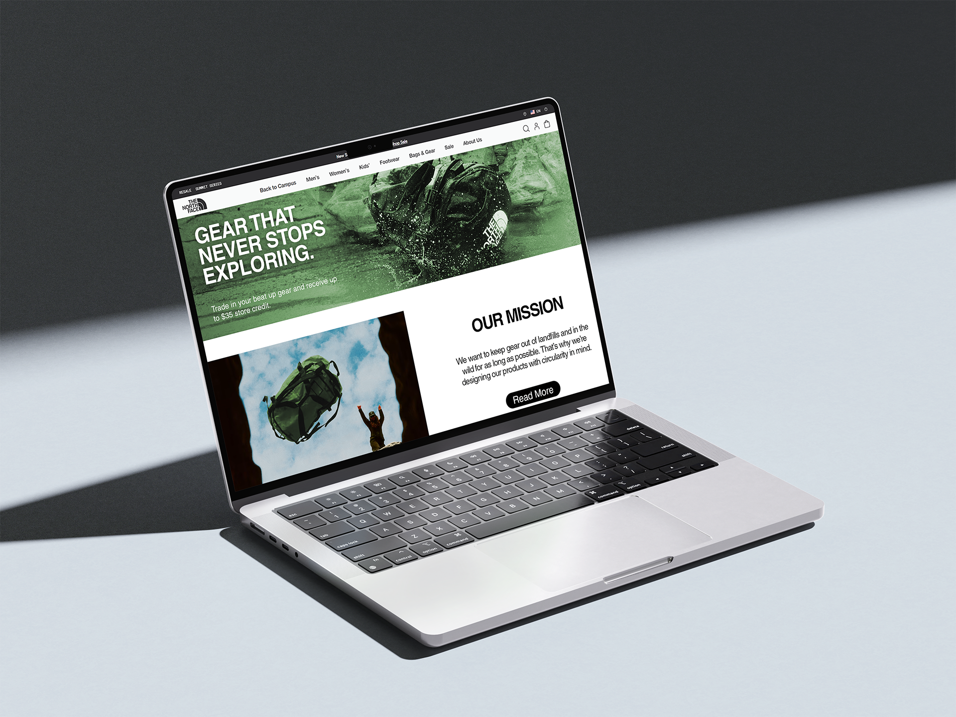
Overview: An integrated campaign to drive engagement with and awareness of TNF’s new product trade-in and recycling program.
This campaign is a nod to the fact that people often hold on to their used gear longer than they probably should because they associate the items with the memories of their adventures.
With “Gear that Never Stops Exploring,” TNF can provide customers a permission structure to let go of their old items, knowing that it’s for a good cause —
and maybe buy some new items while they’re at it!
Colors will skew warm and slightly desaturated.
Nature, old memories, and past adventures, that’s what we’re going for.
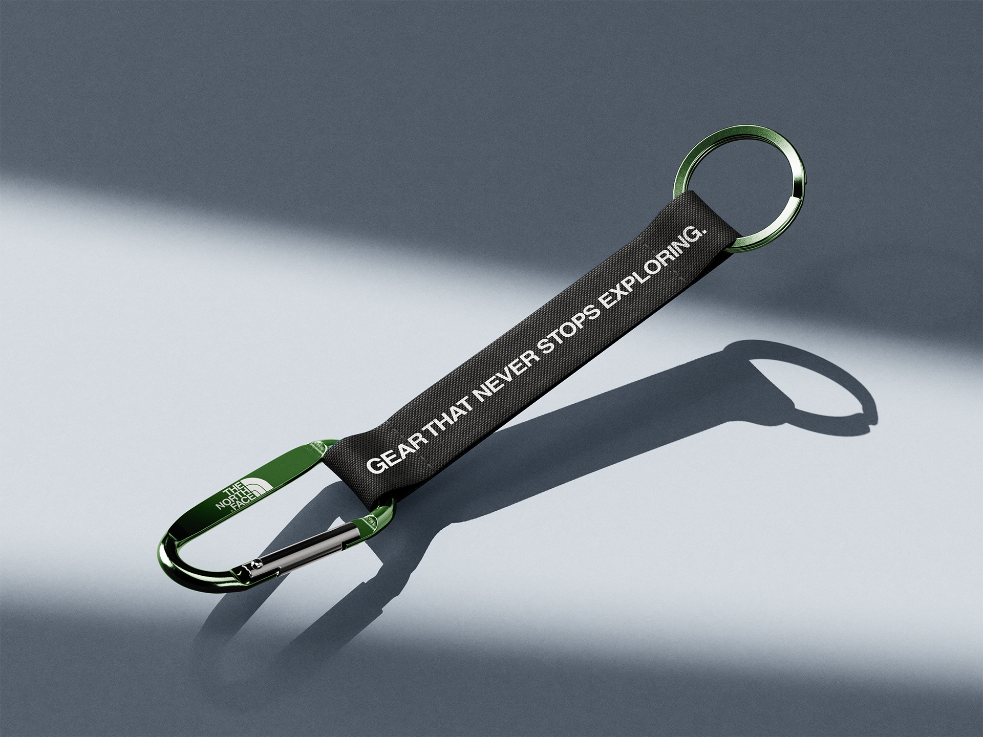
Green will often signify the focal point or object of emphasis. Given the environmental positioning of the campaign, green is a natural choice to anchor ourselves.
Green colorways are preferred when featuring products for this campaign.
Color Theory:

Limited Edition Product:
The North Face x Earth
To coincide with Earth Day, TNF will release limited editions of specific top performing SKUs. These will be made largely from recycled materials (highest % feasible) and opens the door to a potential full product line in the future.
AI Assisted Workflow: Activation Concept
Concept → Chat GPT → Adobe Firefly (Nano Banana 2) → Photoshop
TNF will host an outdoor pop-up in a high-traffic shopping area where visitors can trade in used gear for store credit. Shoppers drop items into donation boxes that empty into a central container; once full, the final donor wins a limited-edition campaign branded item.
Interactive displays guide visitors through redeeming their credit and learning about the recycling program.
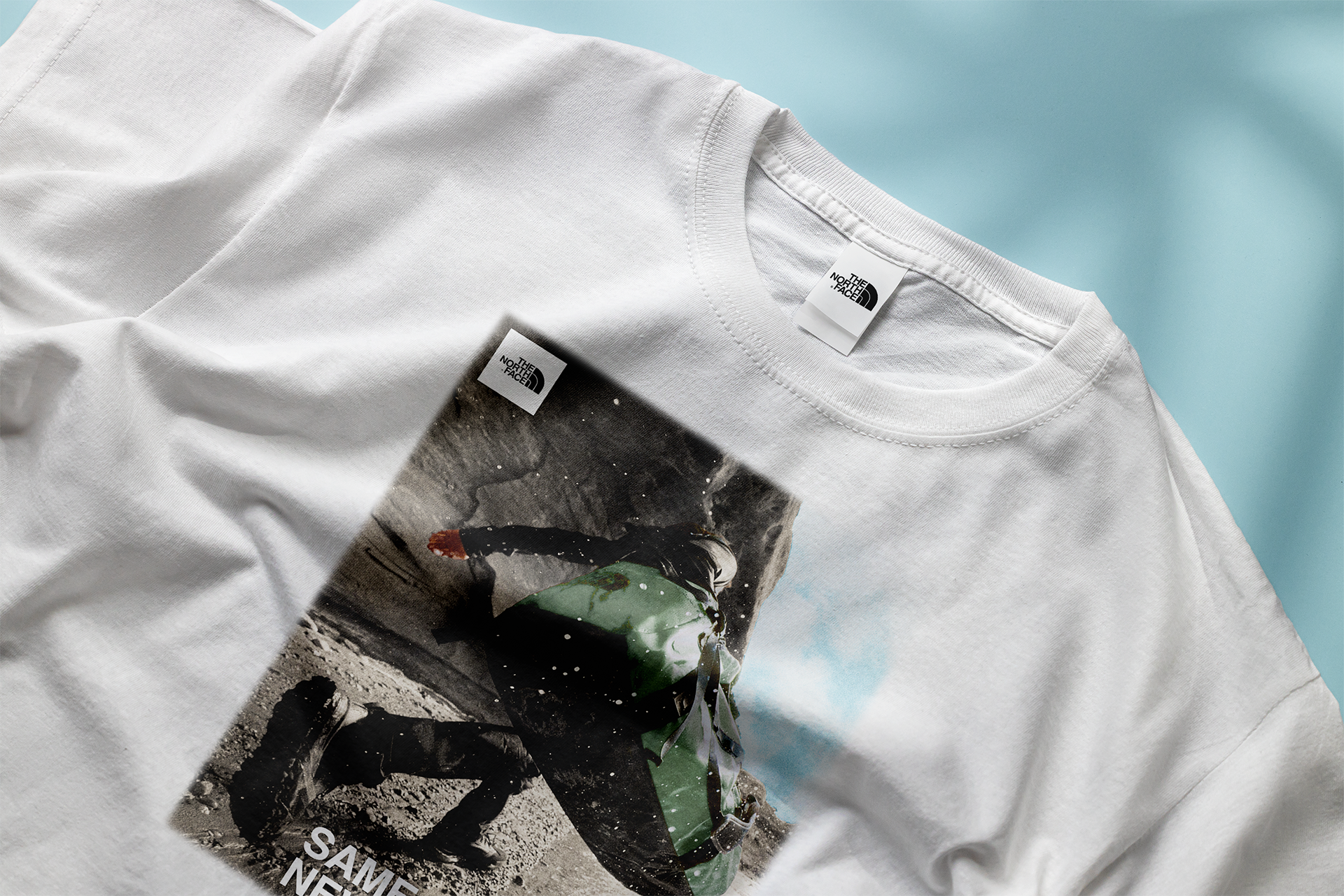
The booth will also sell a selection of campaign branded merch such as beanies, carabiners, lanyards, and T-Shirts.
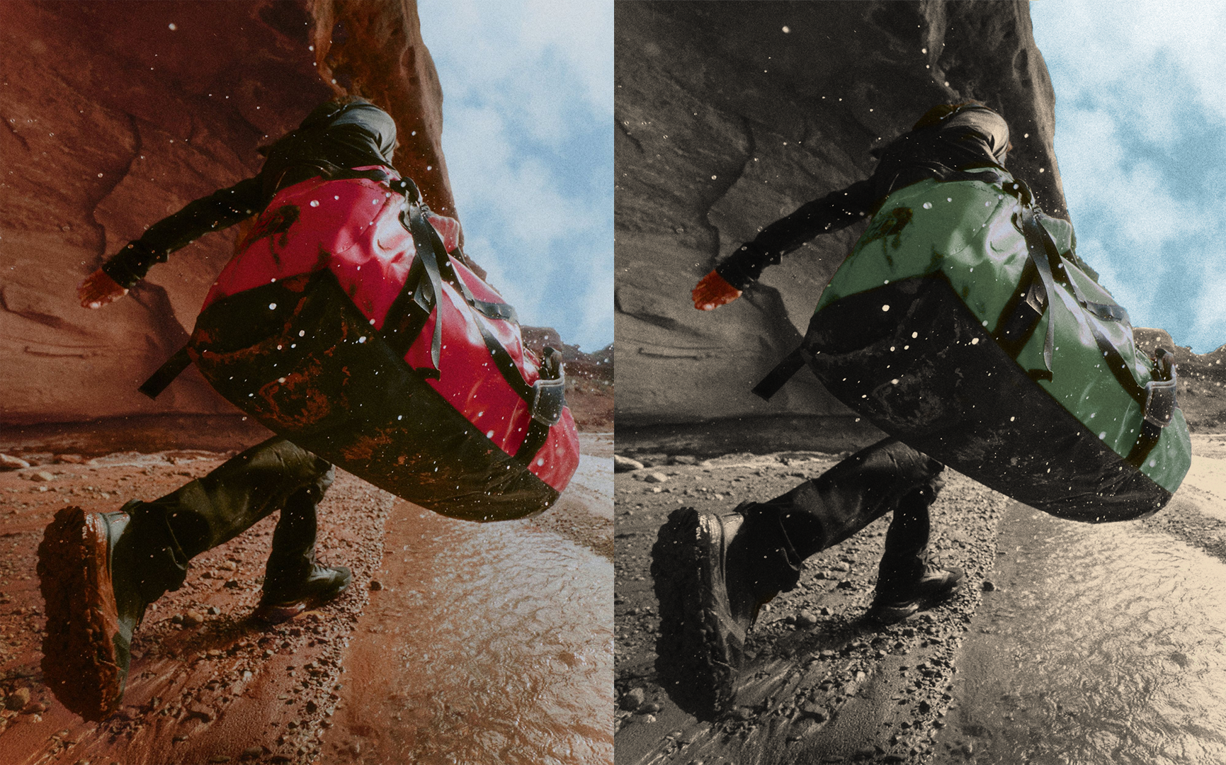
Editing evergreen assets into campaign aligned creative.
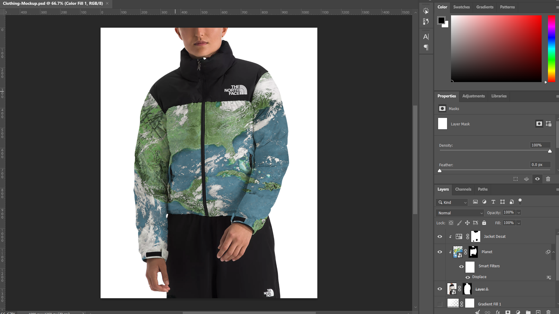
Clothing mockup
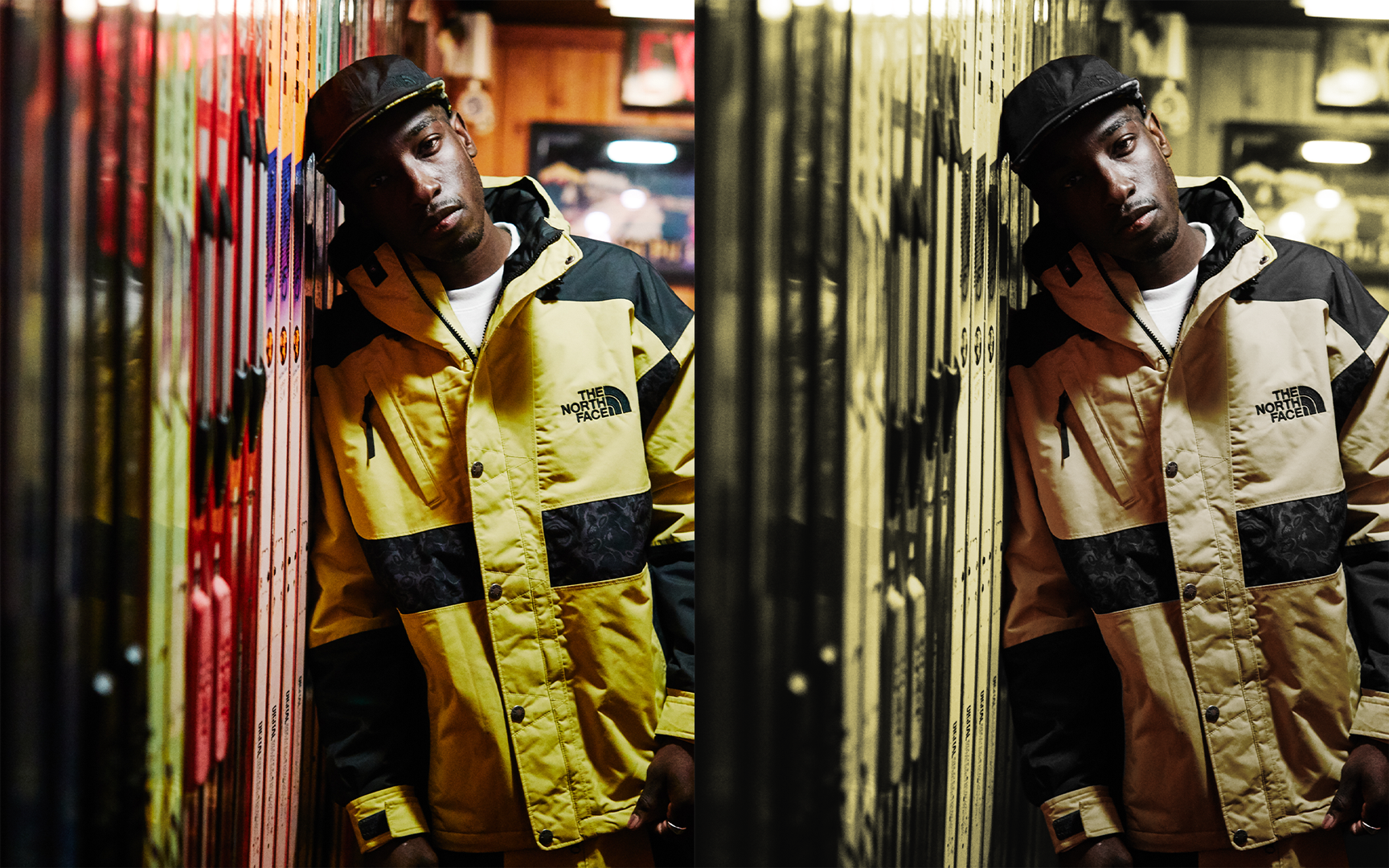
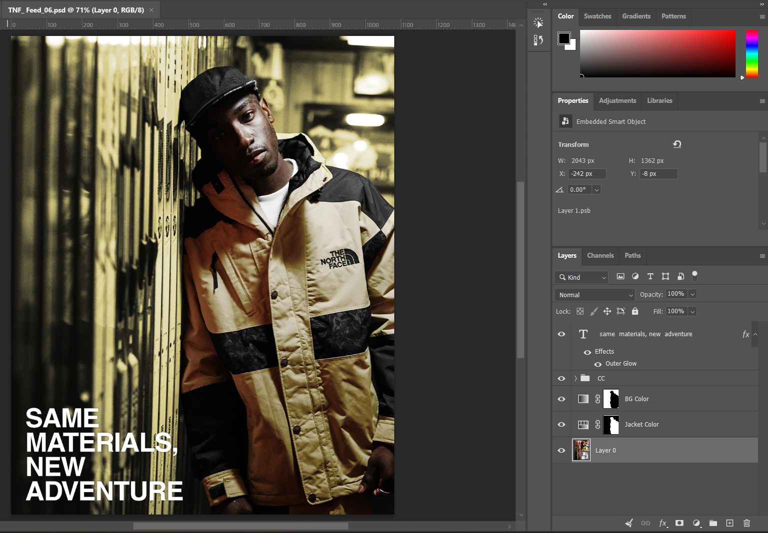
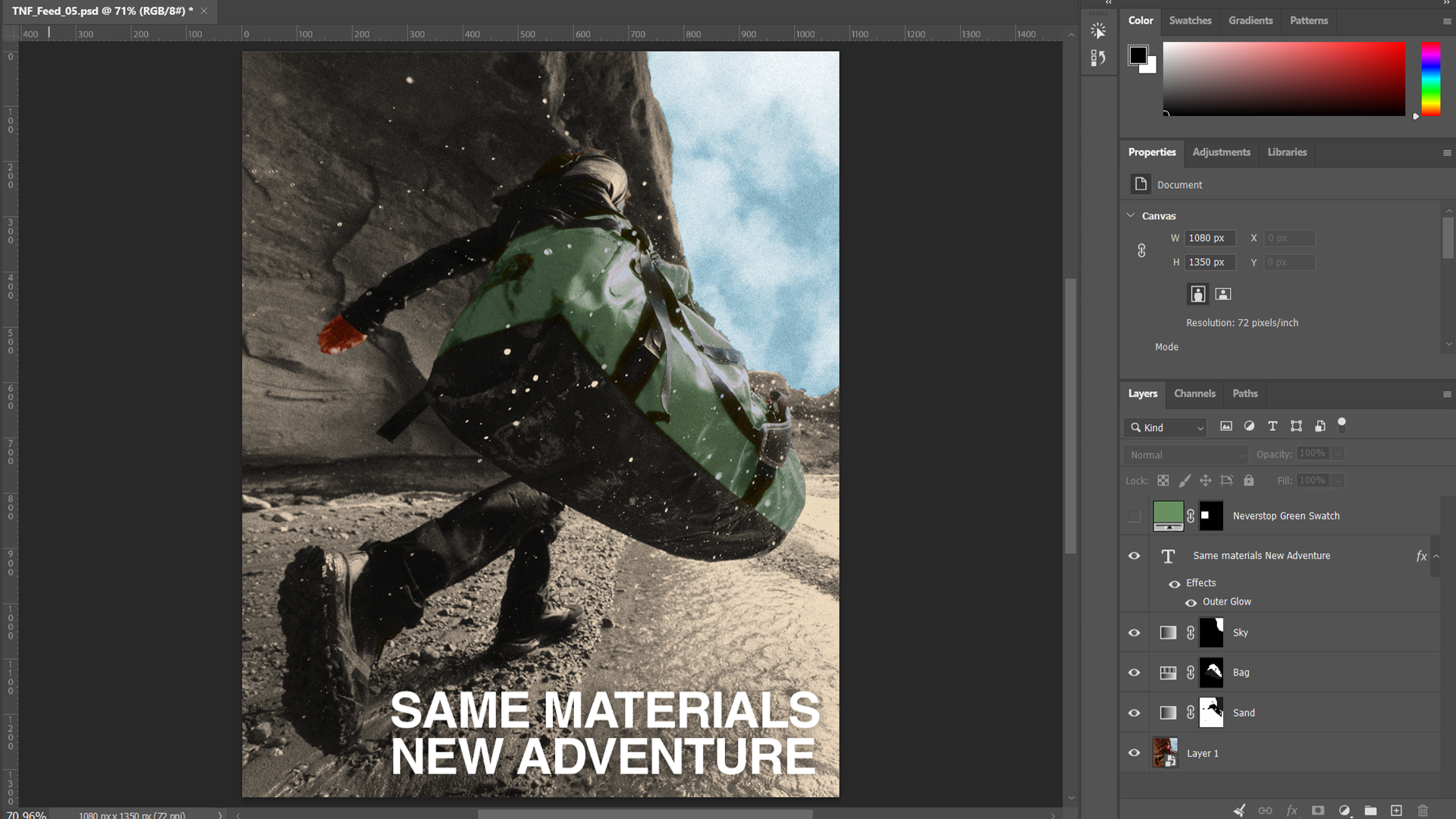
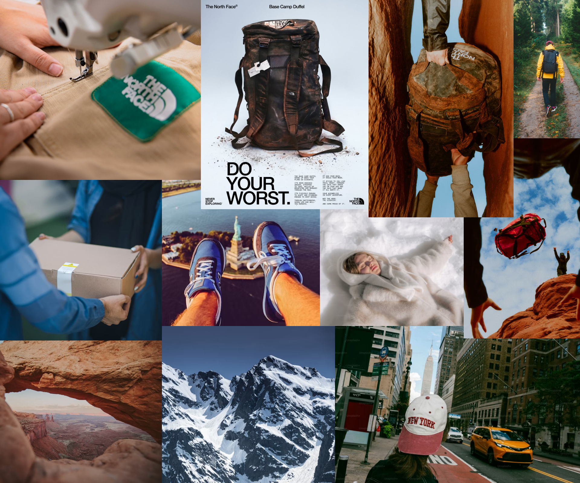
Mood board (includes elements for potential campaign film)
Success Metrics:
Increased awareness of the program.
(x) amount of direct customer participation measured in (y) number of items traded-in.
(x) number of social impressions across campaign posts.
Increased social engagement across all platforms.
(x) amount of landing page traffic driven by campaign materials.
About the project:
I had a lot of fun designing this spec campaign. It’s always a great creative challenge to approach a new client and brand from a fresh perspective. The North Face is a brand that I really appreciate because of their quality, their style, and their environmental commitment, so it was definitely more of a passion project for me.
Thanks so much for taking the time to check it out! If you’d like to see more of my work, you can click the button below.
Thank you!